UX Strategy, UX Design and Interactive Design for educational tools for the Museum of American Revolution
Created at AREA 17
“How do we design from a human-sized digital experience to a desktop/tablet/mobile one, keeping its strength and interactivity?”

Roles
UX Researcher
Actively participated in UX research, including the definition of personas, user goals, flows, and journeys.
UX Strategist
Worked closely with the Product Strategist to define the business goals, key performance indicators, and product goals.
Lead UX Designer
Synthesized all the research, created low- and medium-fidelity prototypes for the two web products, and iterated them based on user feedback.
Interactive Designer
Created key interactions and UI Design direction for Visual Designers and Front End Engineers.
Methods
Research
User research
UX workshops
Stakeholder interviews
Personas
Design & Prototype
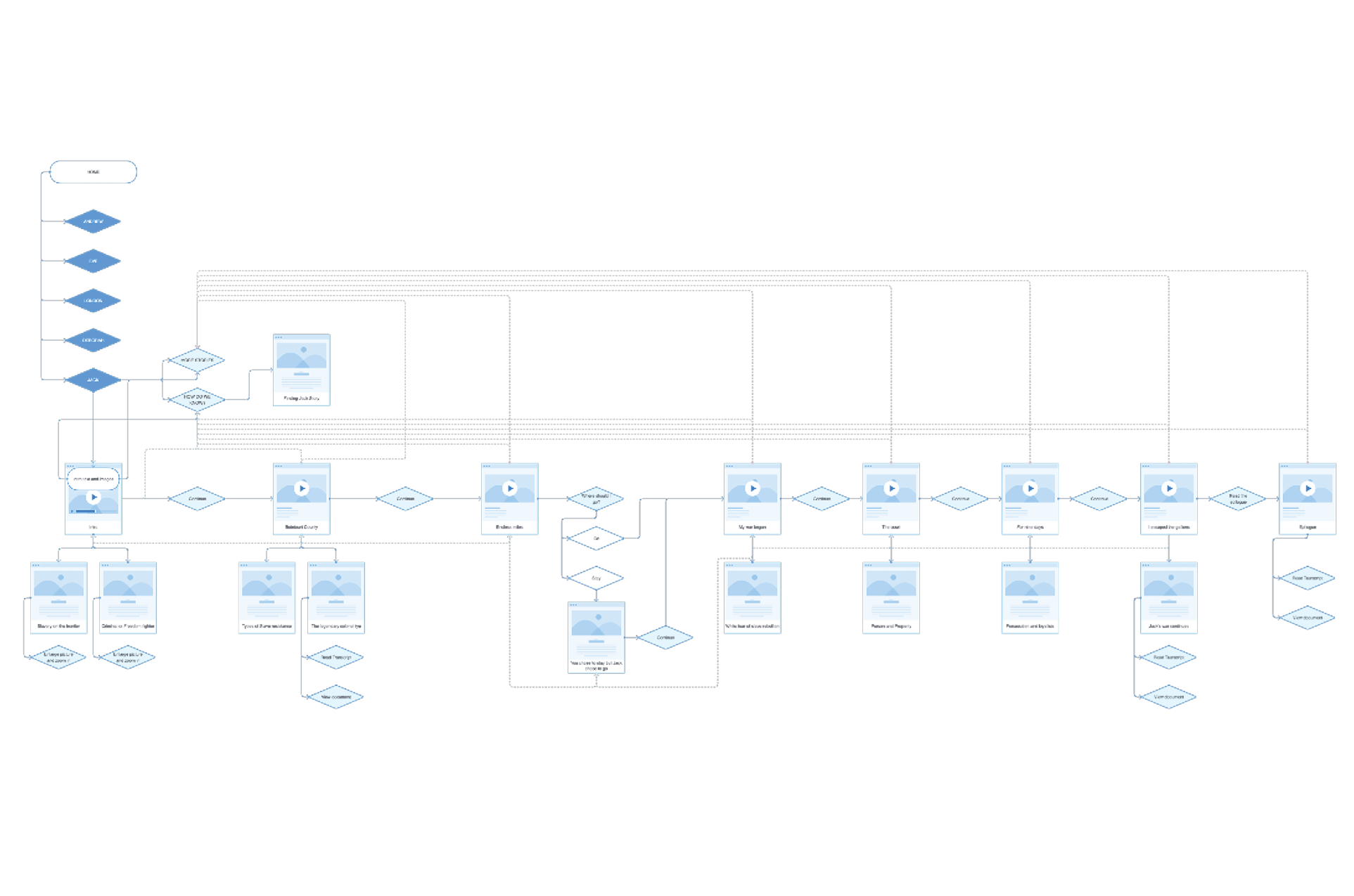
Site map
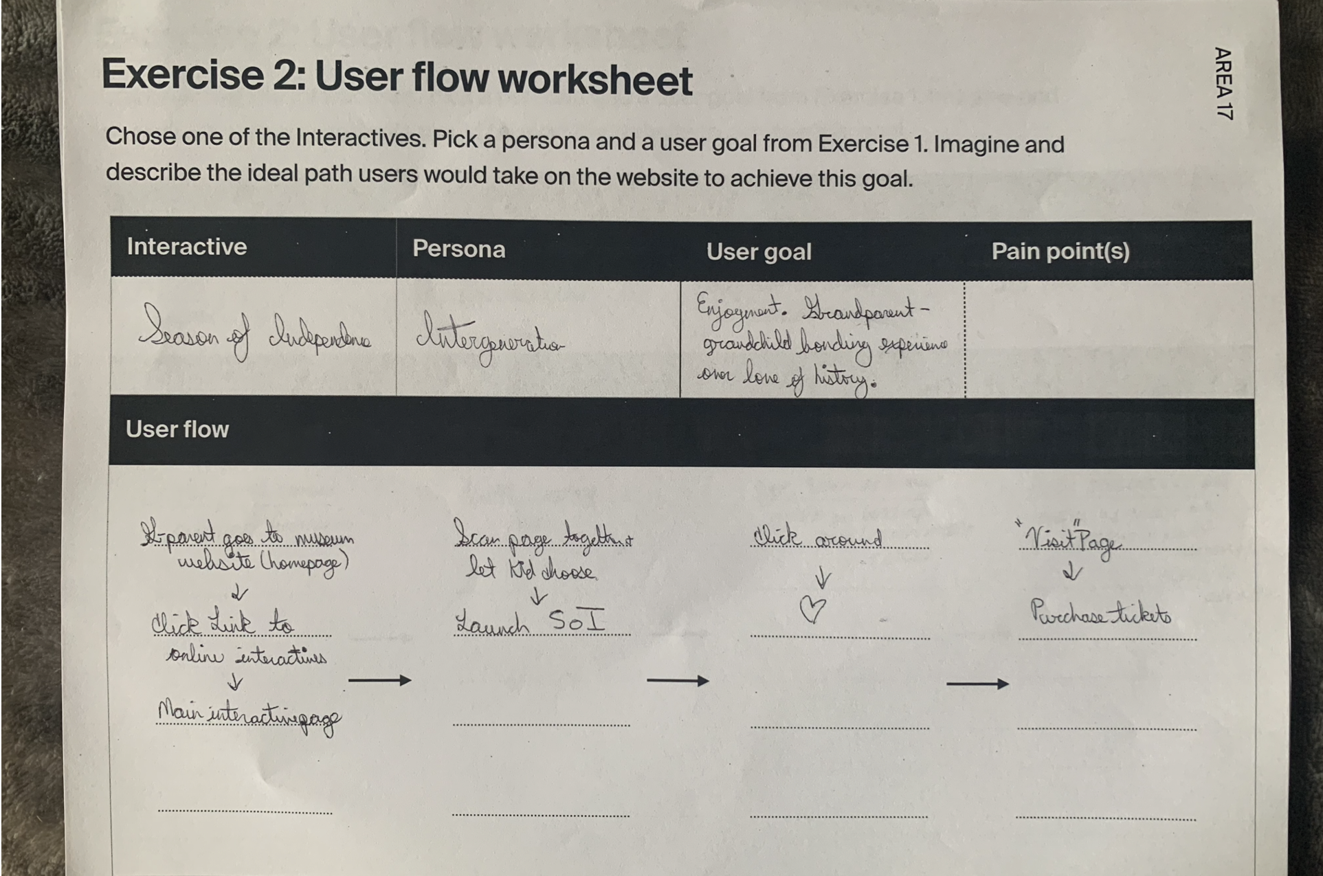
Users flows
Low-fi prototypes
Mid-fidelity wireframes (Figma)
Mid-fidelity prototypes (Principle)
Clickable prototypes (Figma)
““The project will maintain the scope, themes, thoughtfully-selected artifacts and objects, rich scripts, and high-quality illustrations of the gallery installation, enhanced by new research, images, audio and video, and lessons to ensure that the online iteration is effective as a classroom resource.” ”
Context
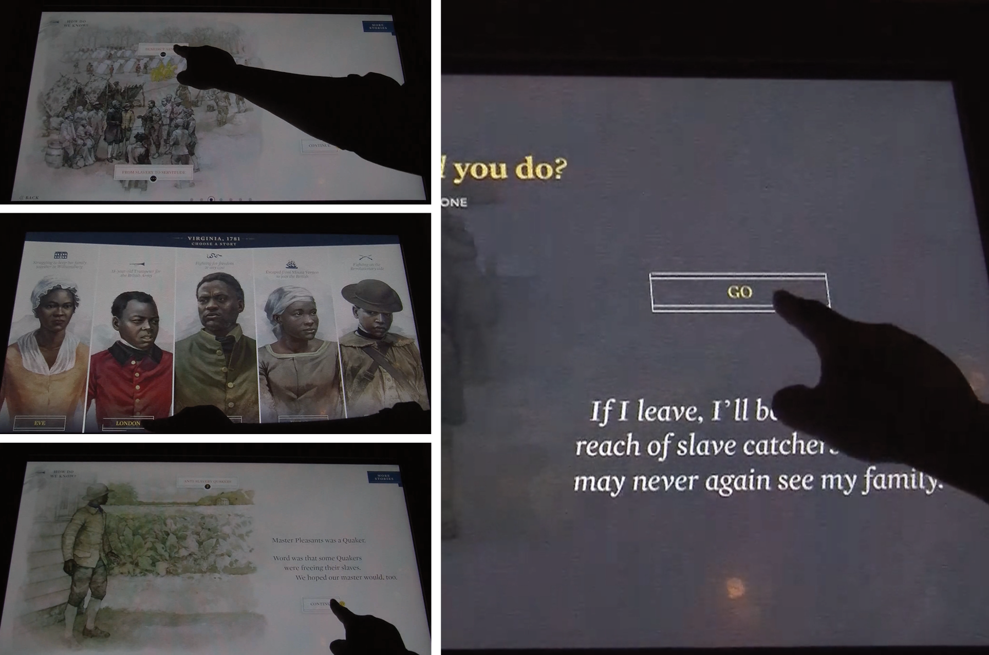
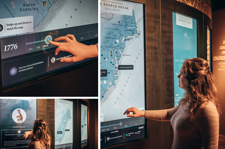
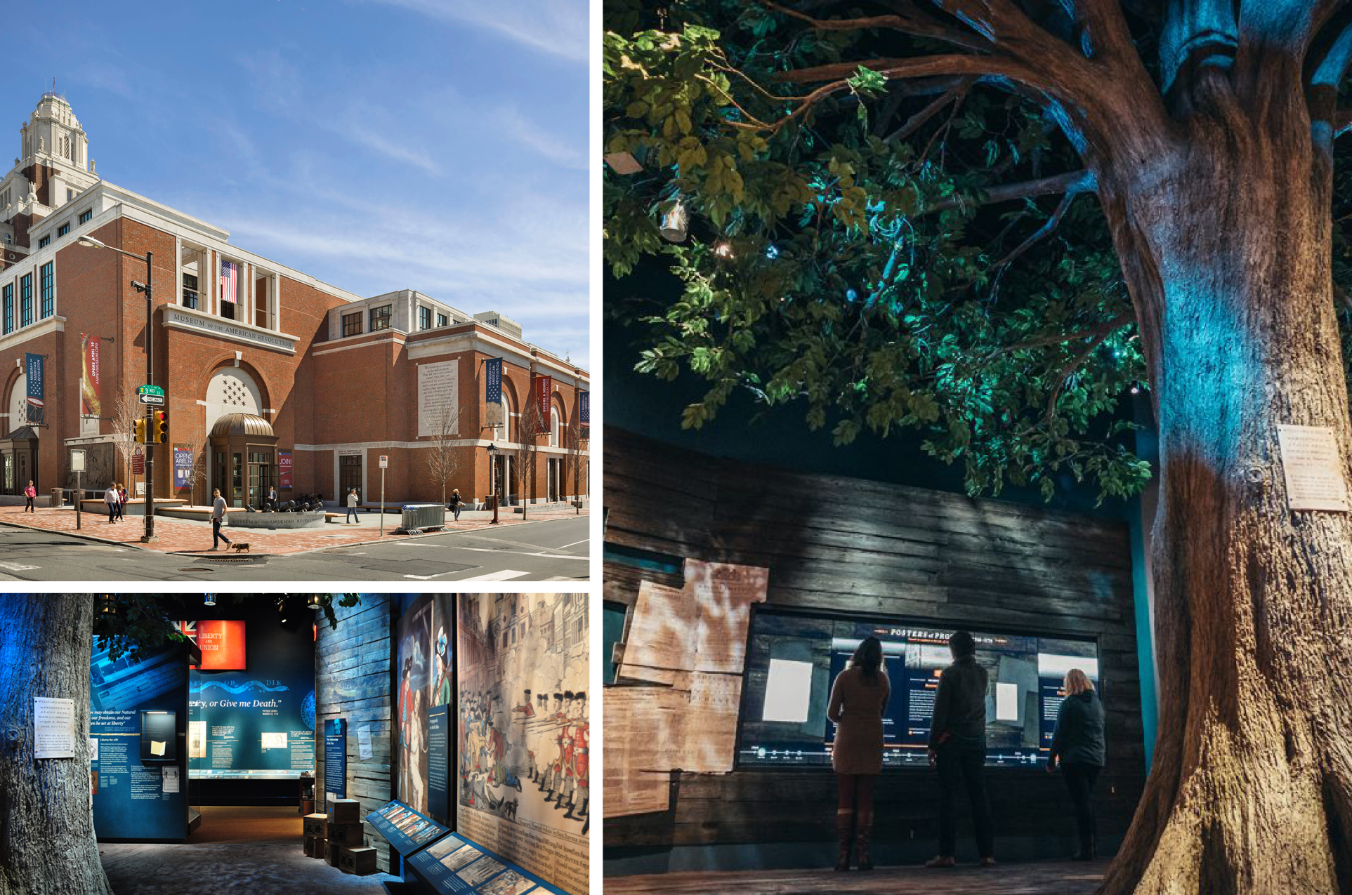
The Museum of American Revolution in Philadelphia offers in-person digital experiences within its exhibitions.
Some of these exhibit experiences needed to be adapted for the web, with a focus on teachers as primary users. We developed two web experiences designed as educational tools, both built on our in-house CMS (Twill).
The challenge was to integrate these two products into the main website, while also providing valuable teaching resources to the target audience.
We began by studying and documenting the user flows of the current digital experiences in detail.
User types, goals and personas
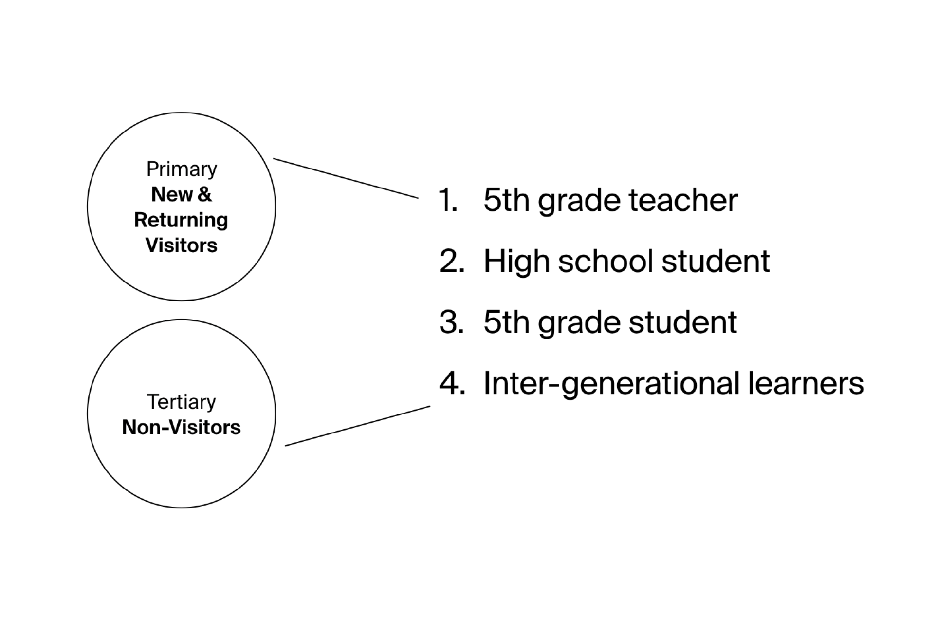
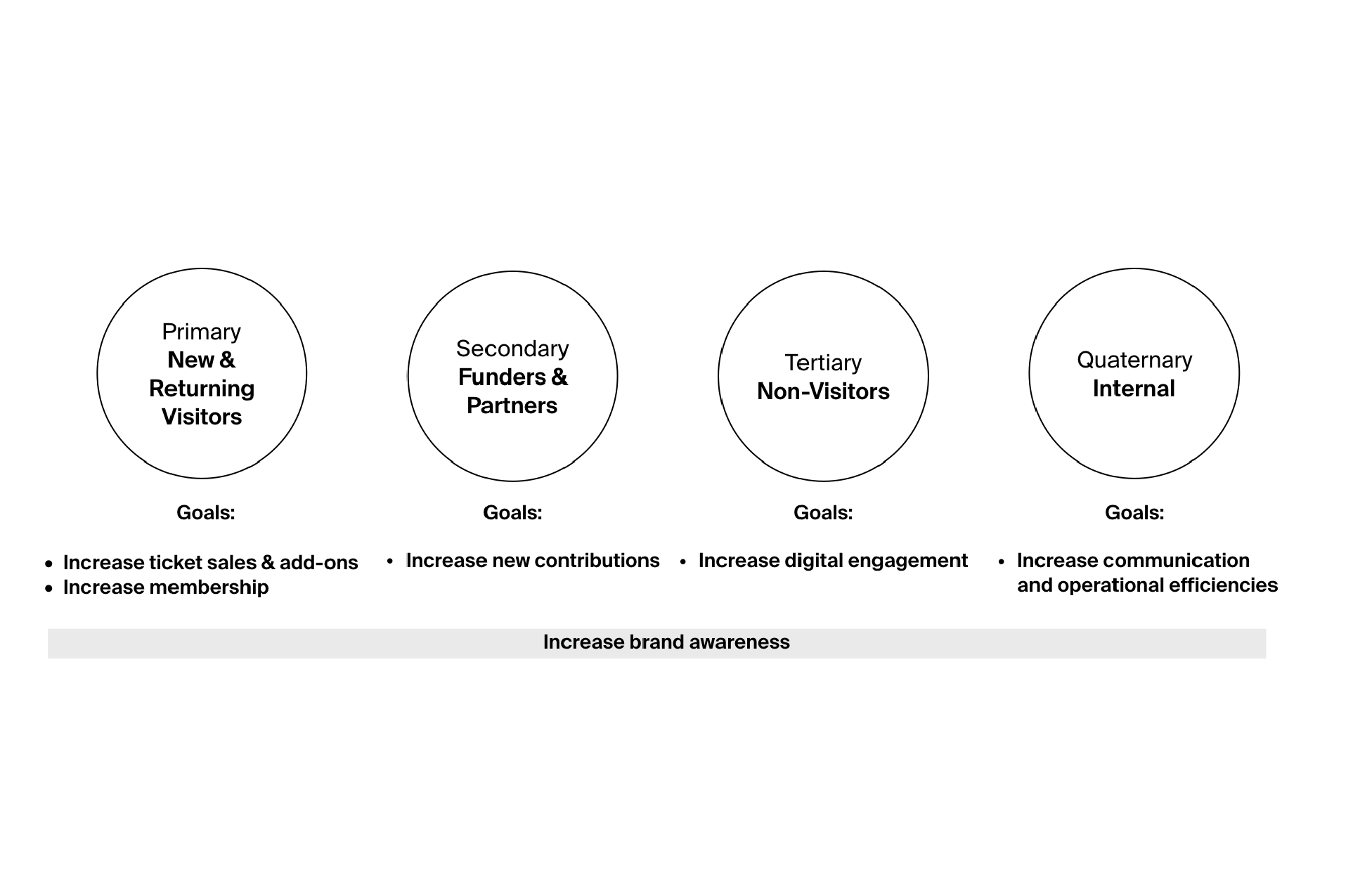

During the first phase of the project we identified and prioritized four audience groups:
New & Returning Visitors (visitors, members)
Partners (donors, funders, programming partners, peer organizations)
Non-Visitors (digital explorers)
Internal (executive leadership, educators & curators, management, staff)
We also identified Museum’s goals for each group and created personas to represent them.
UX workshop
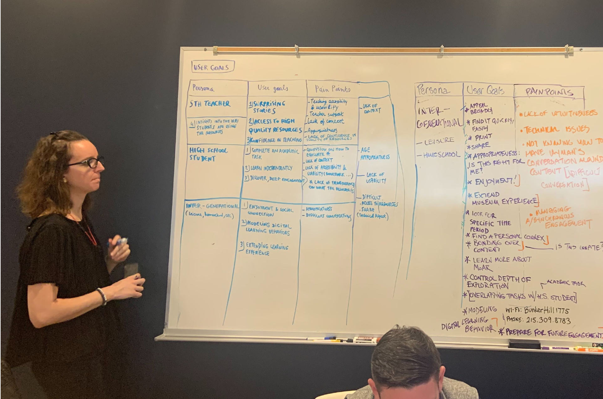
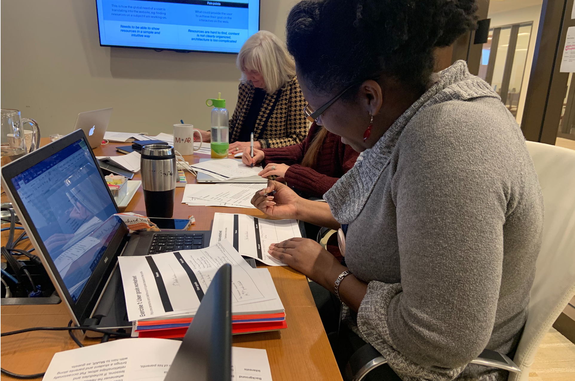
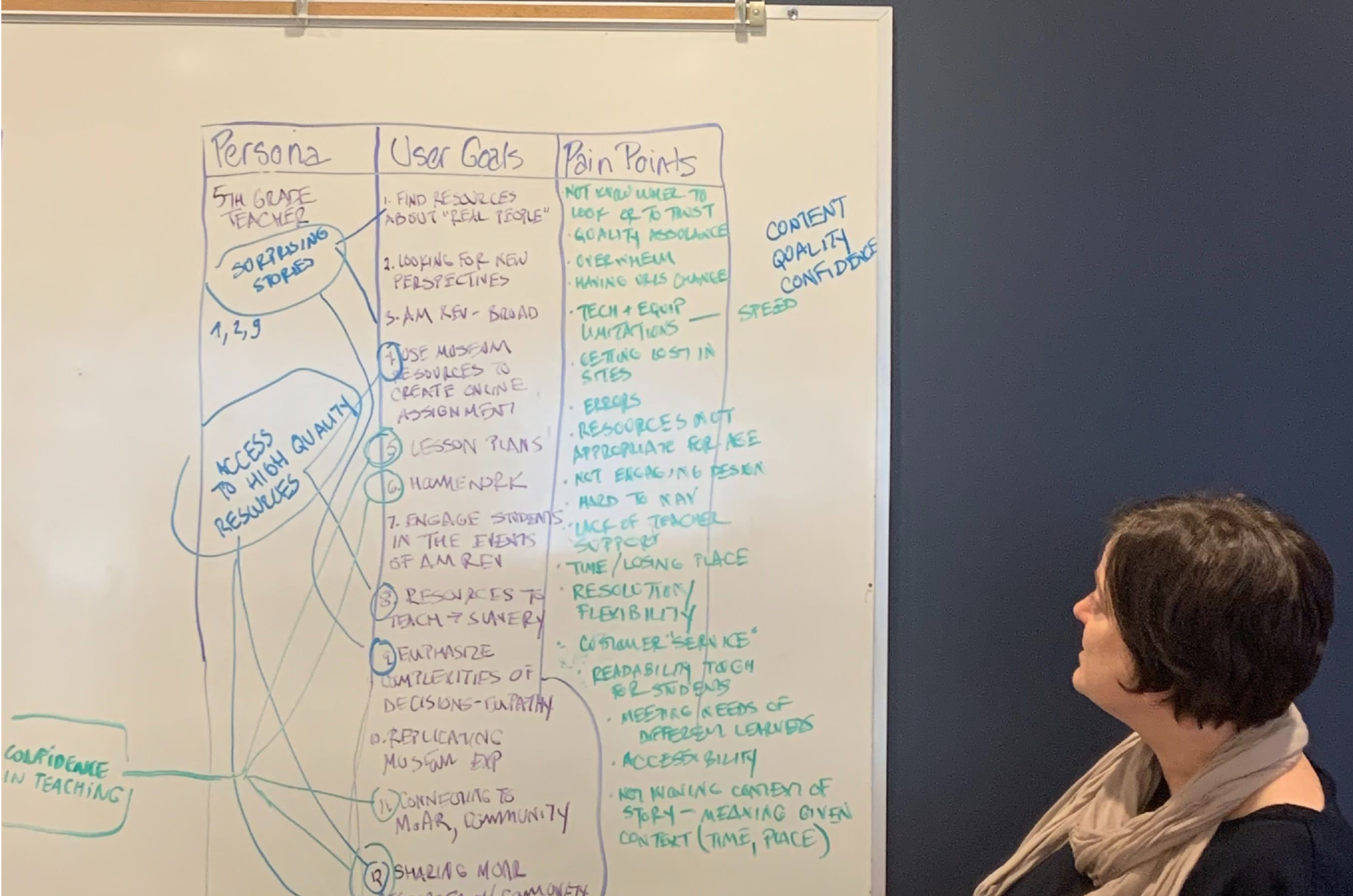
We had a one-day workshop with the main stakeholders, having them brainstorming around user types, user goals, user flows and possible pain points.
We focused on teachers, students, and families who fall into New & Returning Visitors and Non-Visitors groups, since they are the ones who will use the interactive tools the most.
UX workshop findings
User considerations are:
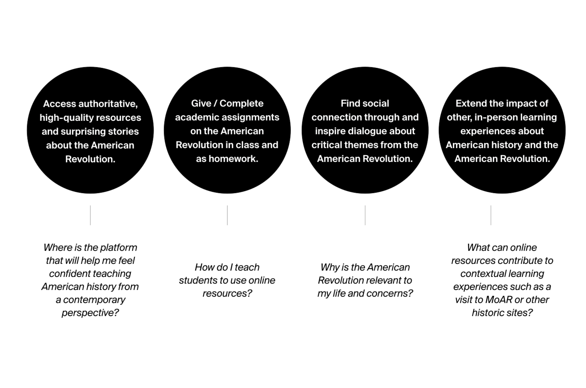
Which platform will help me feel confident teaching American history from a contemporary perspective?
How do I teach students to use online resources?
Why is the American Revolution relevant to my life and concerns?
What can online resources contribute to contextual learning experiences such as a visit to MoAR or other historic sites?
User goals are:
Access authoritative, high-quality resources and surprising stories about the American Revolution.
Give / complete academic assignments on the American Revolution in class and as homework.
Find social connection through and inspire dialogue about critical themes from the American Revolution.
Extend the impact of other, in-person learning experiences about American history and the American Revolution.
“By consolidating the Museum’s message, showcasing its unique, in-person experience, and removing friction from critical paths, online, we can excite visitors’ sense of discovery. ”
Jobs to be done and critical paths
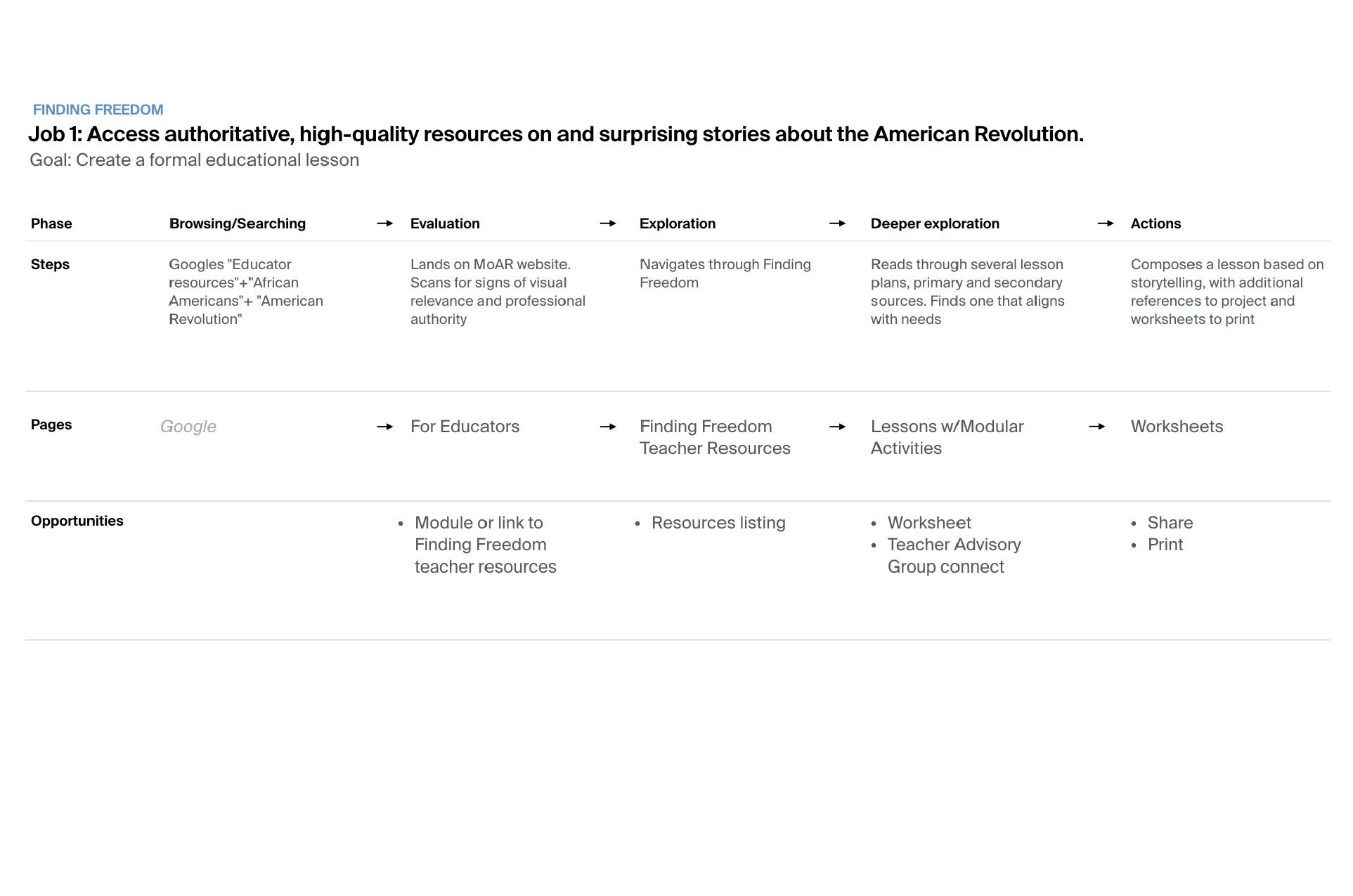
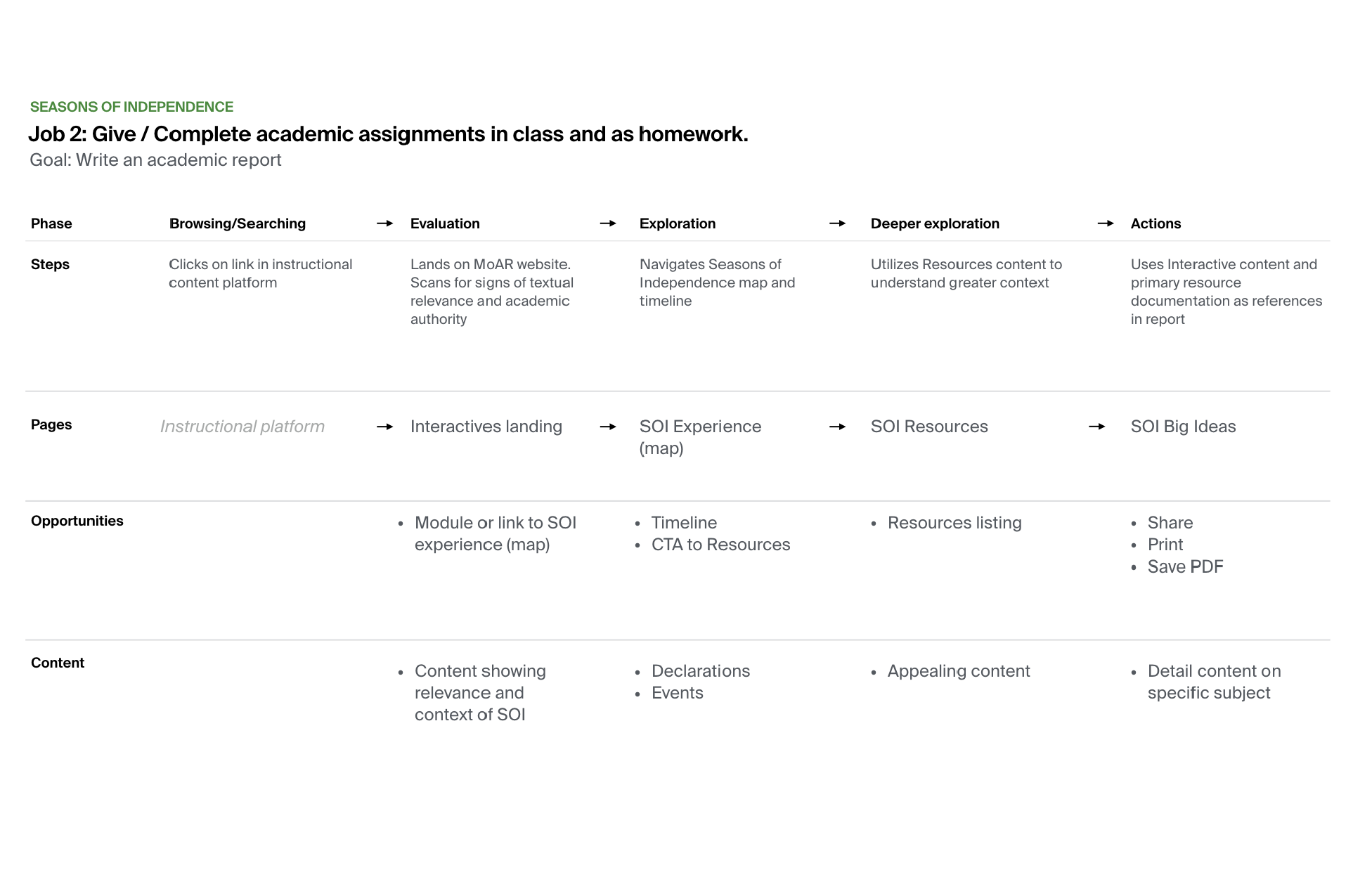
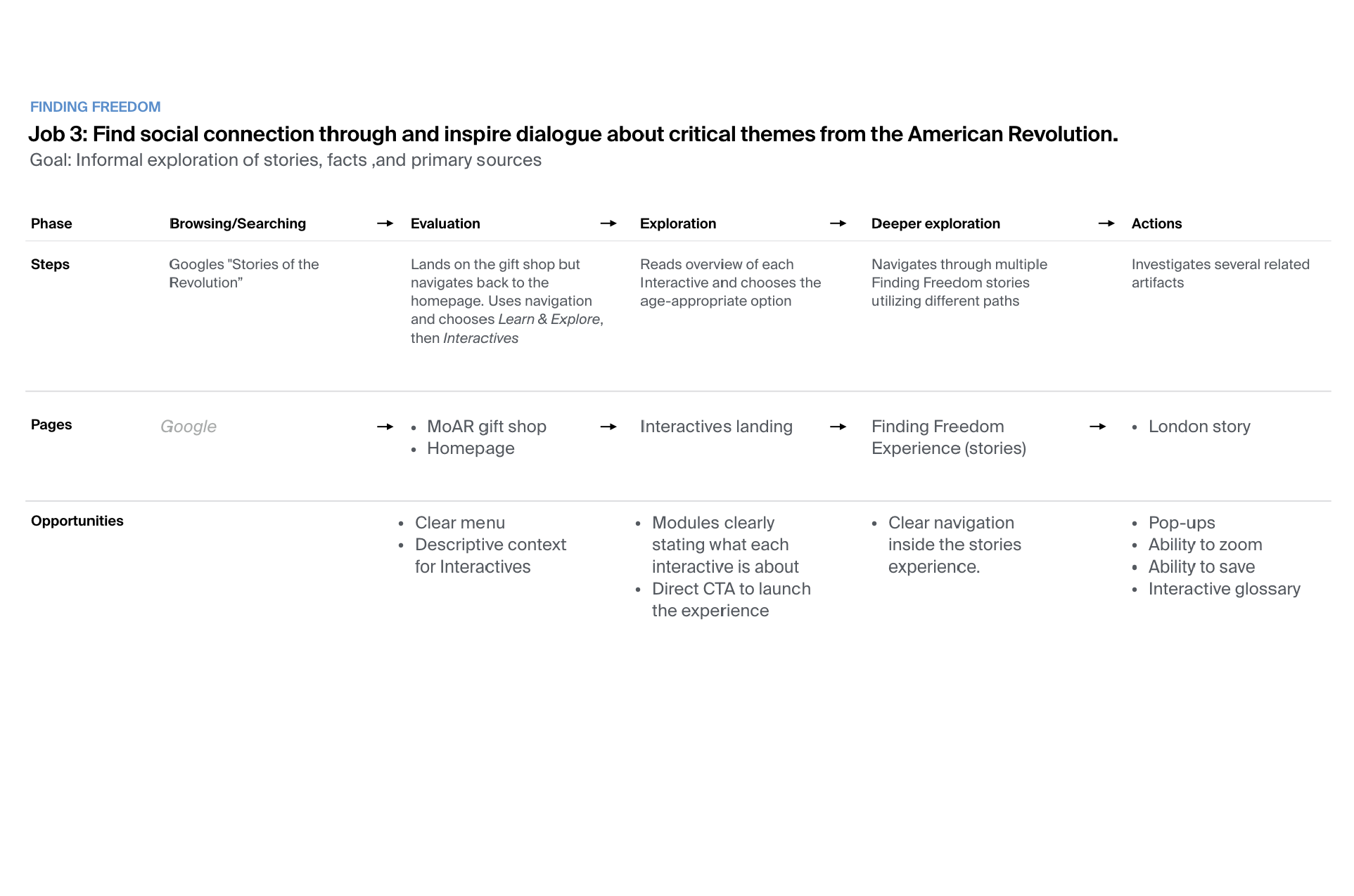
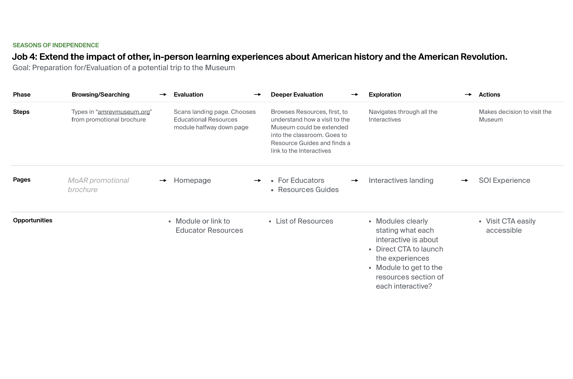
Based on user goals, we determined the products’ jobs to be done and then mapped several critical paths identifying core pages and opportunities for our two products.
Critical paths represent the ideal paths a user might take as they seek to achieve their desired outcomes.
“When we talk about educational interactivity the focus is on what the user does to access content, and how that action allows them to best interpret that content— how it impacts them. ”
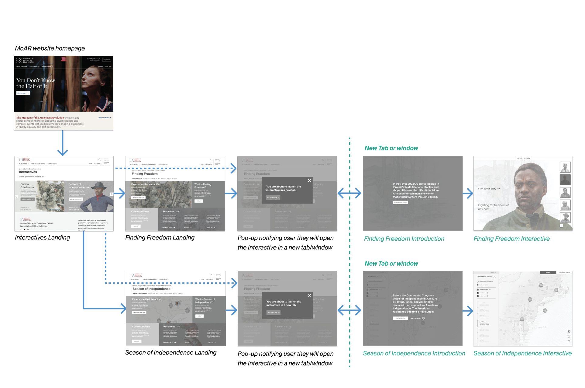
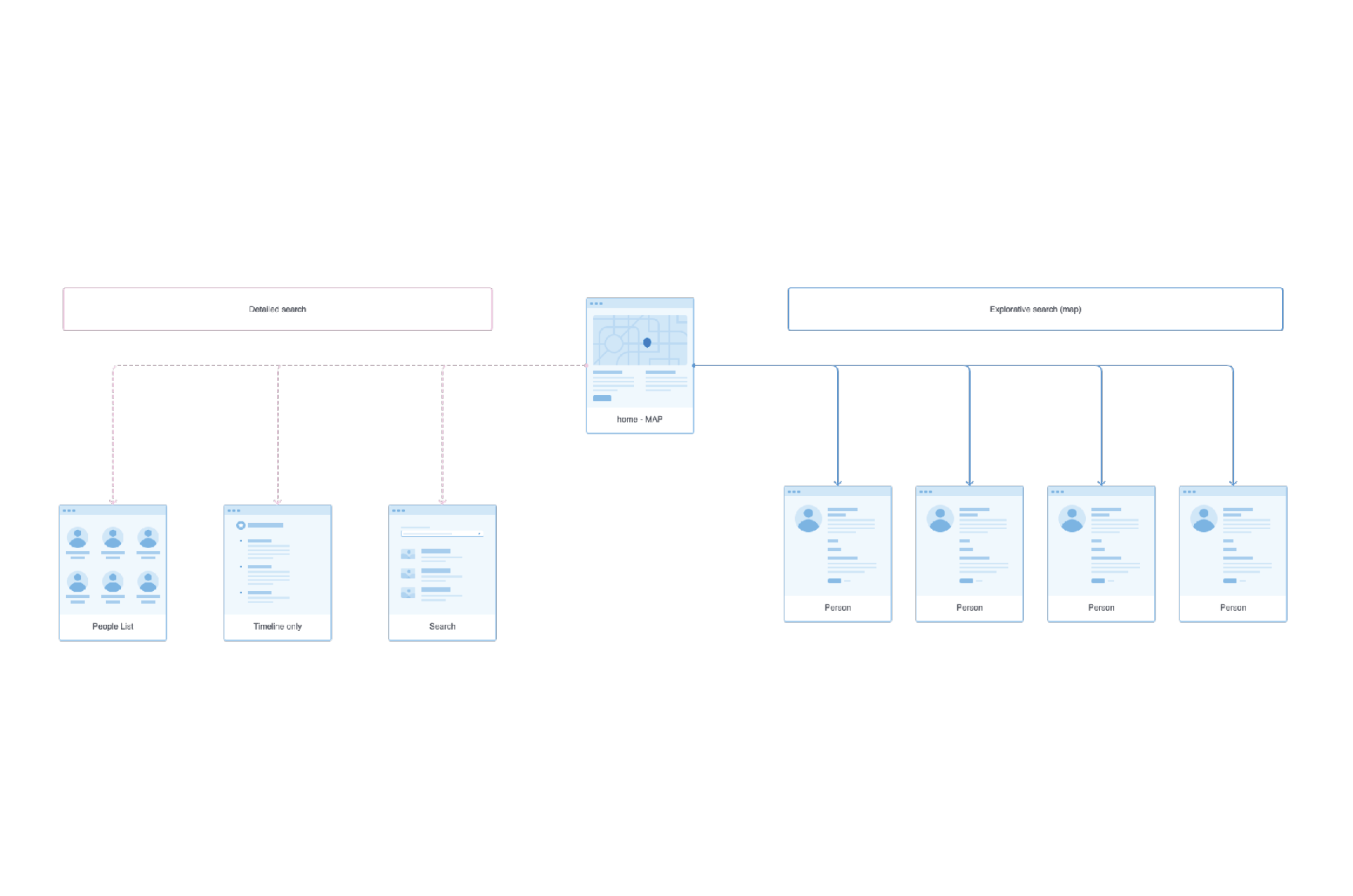
Site map and core pages
“How do we integrate those immersive experiences into the main website? ”
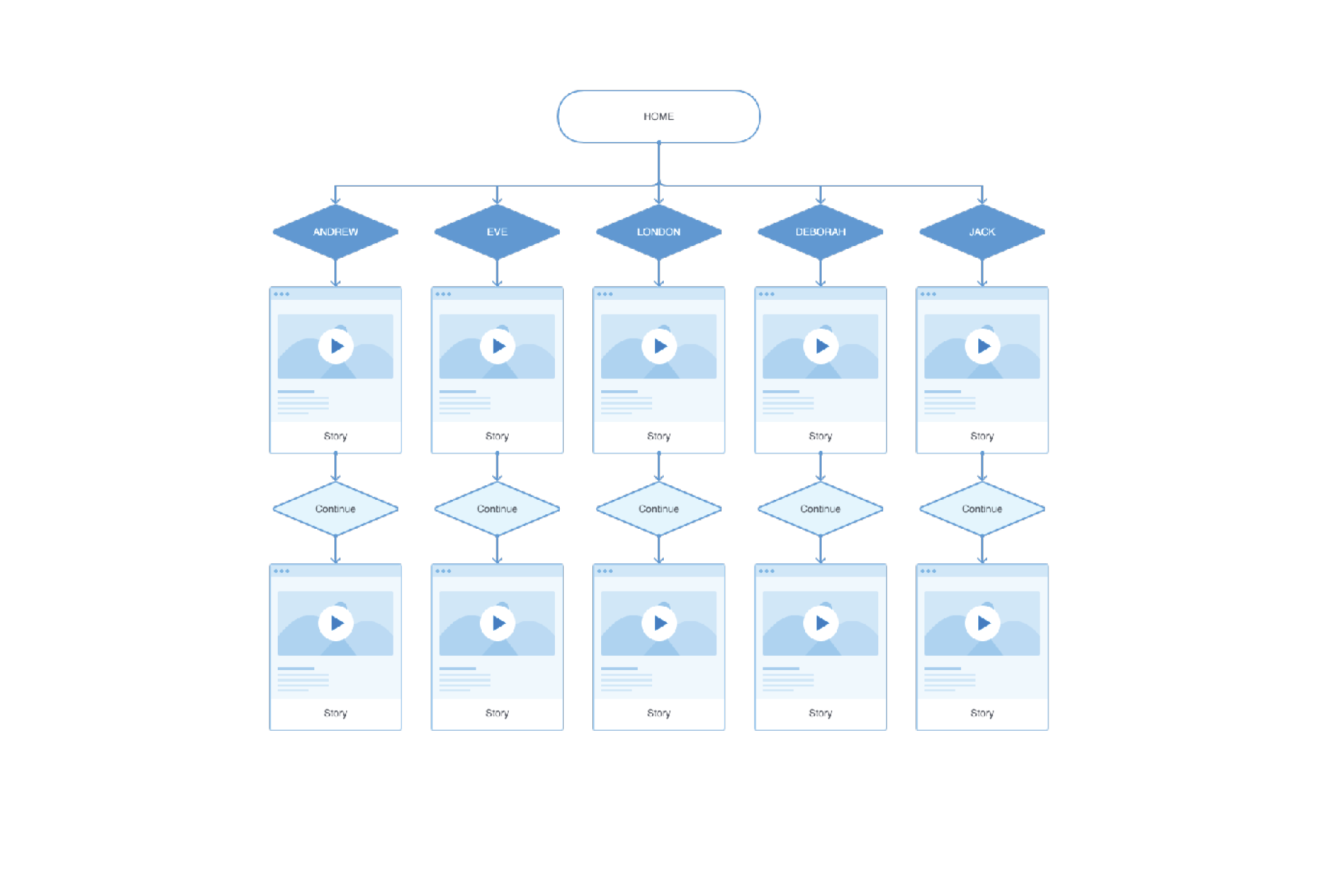
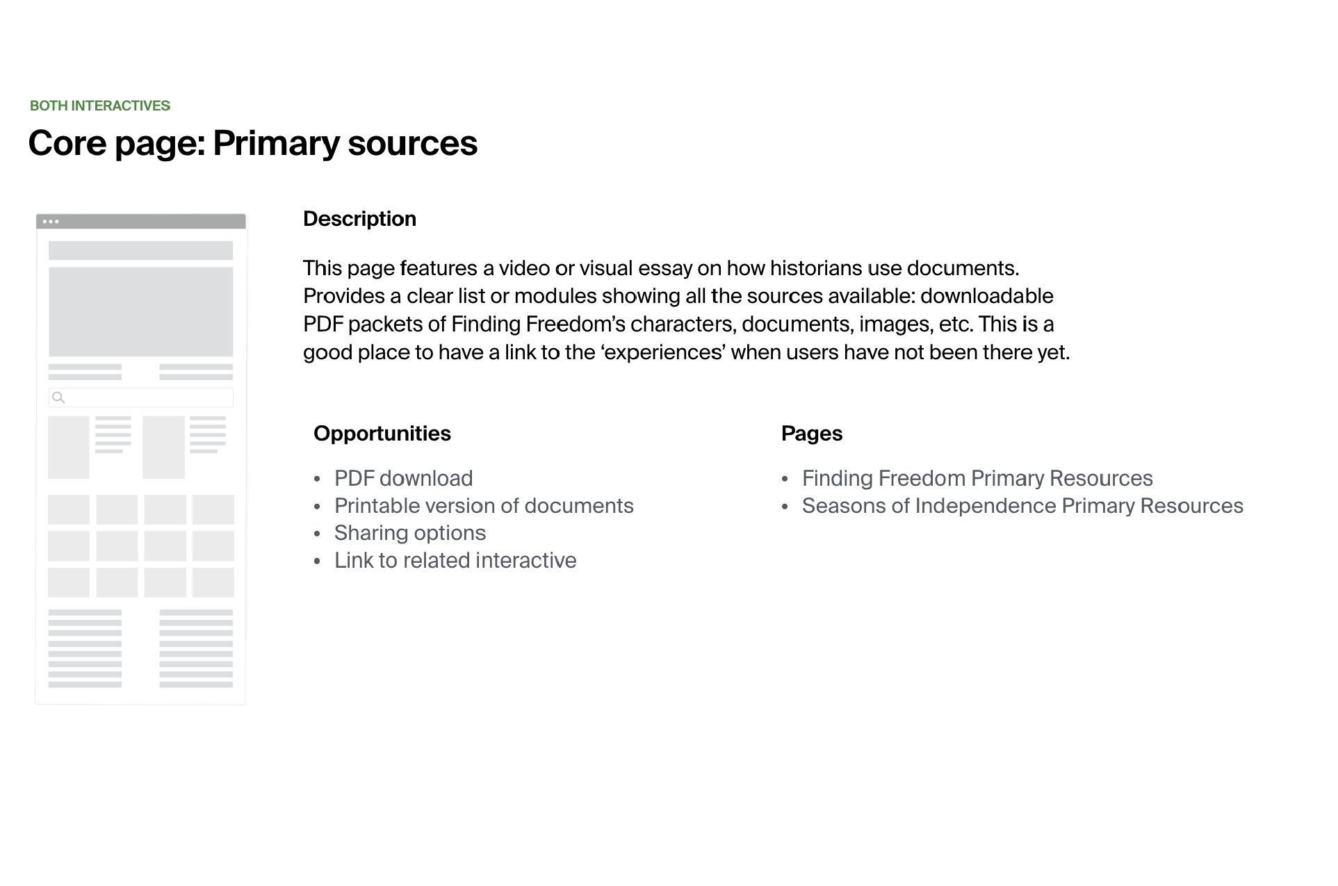
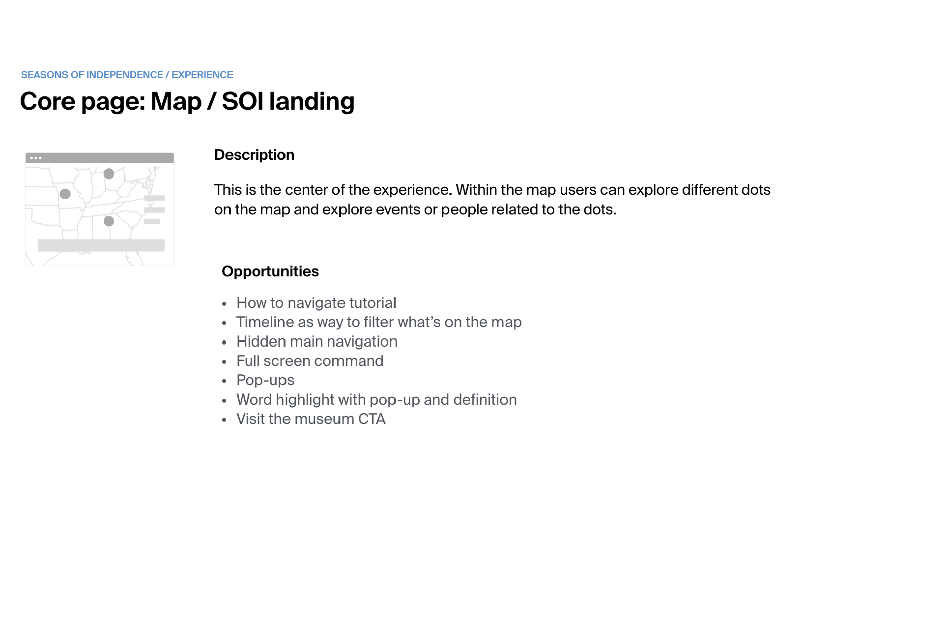
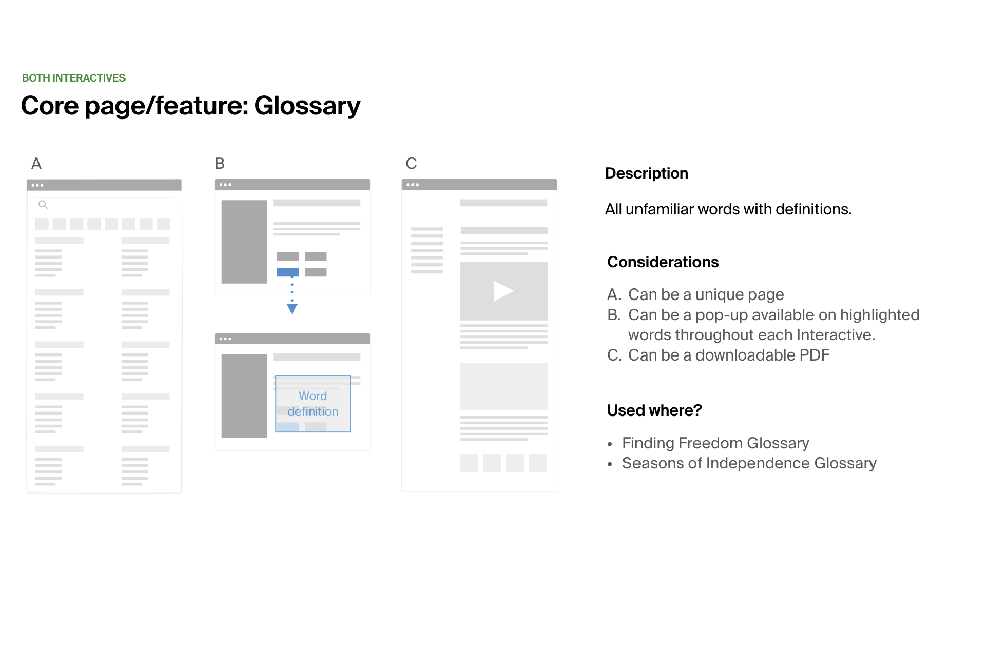
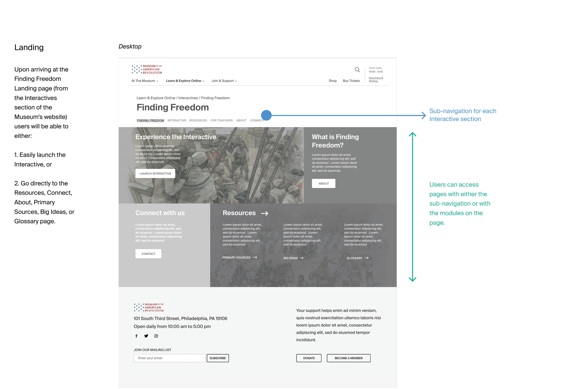
Defining critical paths helped us to determine the backbone or core product experience in terms of overall site structure, organization, and pages.
The site map groups and organizes the core pages and related content.
Navigation exploration
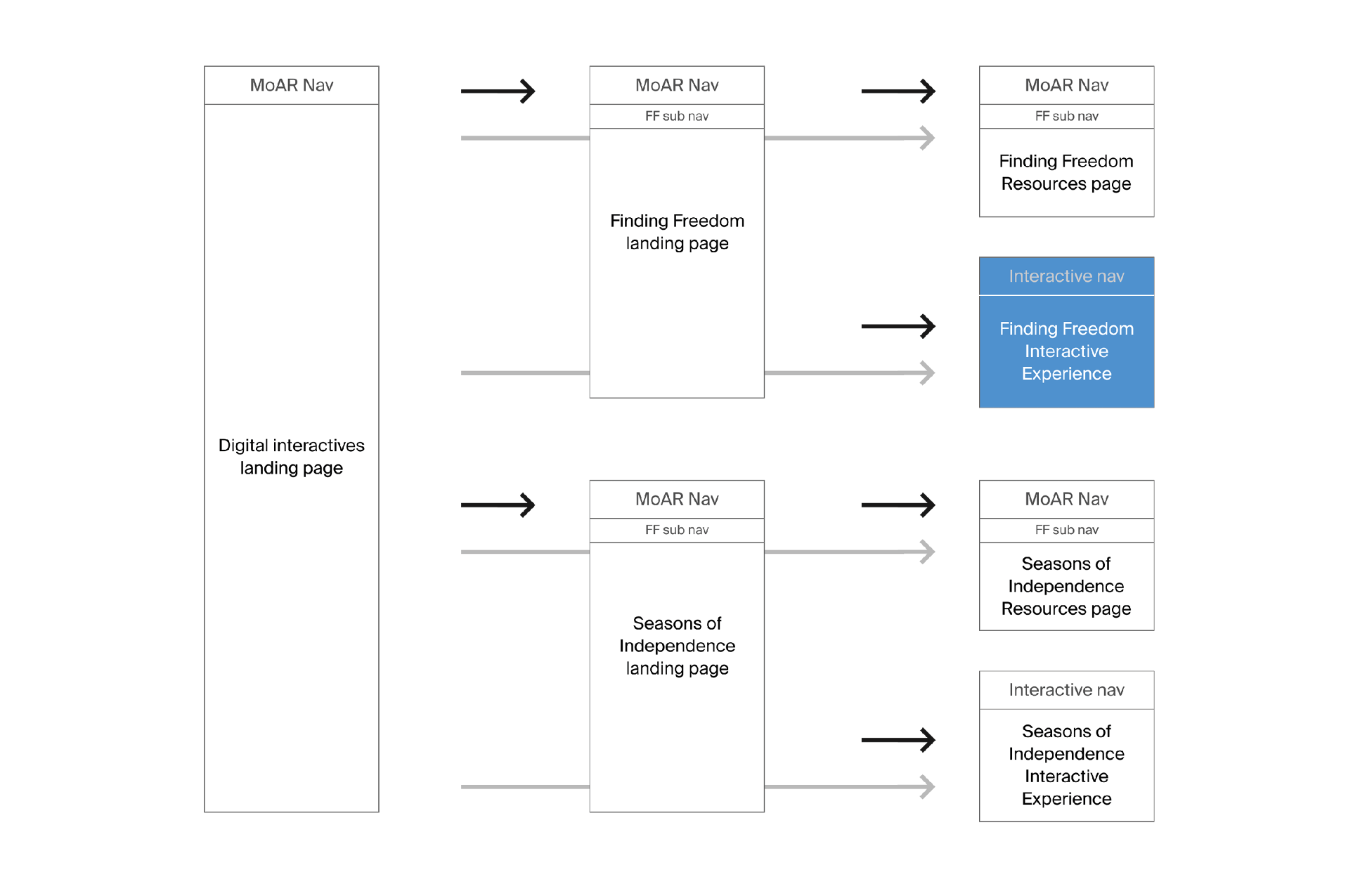
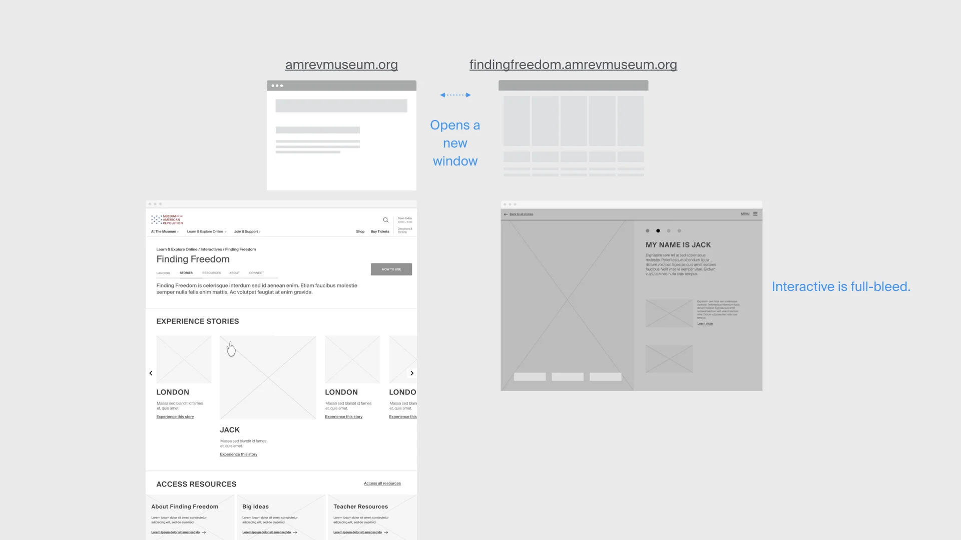
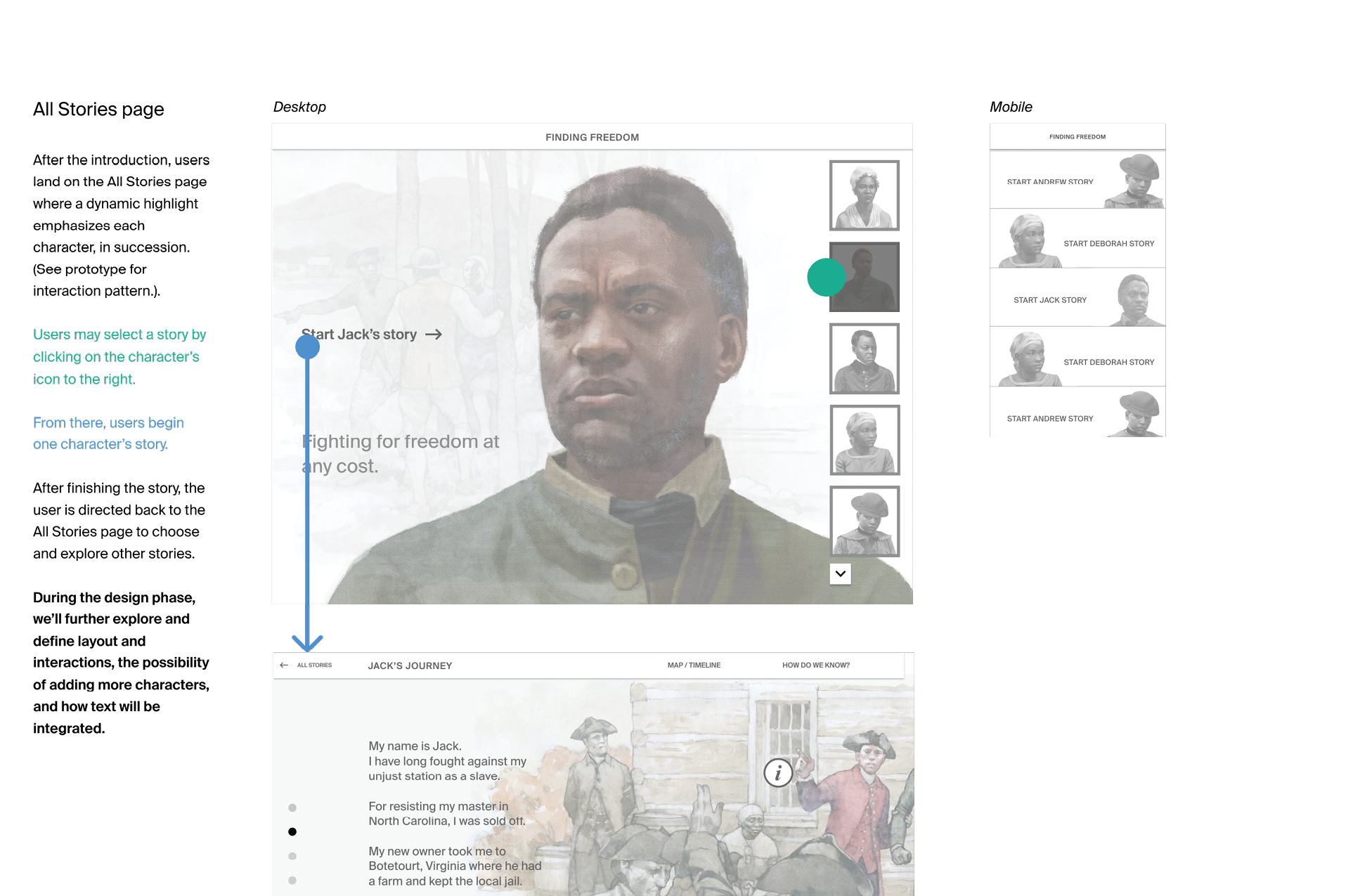
Navigation for each product should reflect the narrative's unique character, and simulate the look, feel, and functionality of the gallery analog.
The user should be able to simultaneously view — or toggle between — the landing page and the product experience, without accidentally closing one or losing their place in the other.
Wireframes

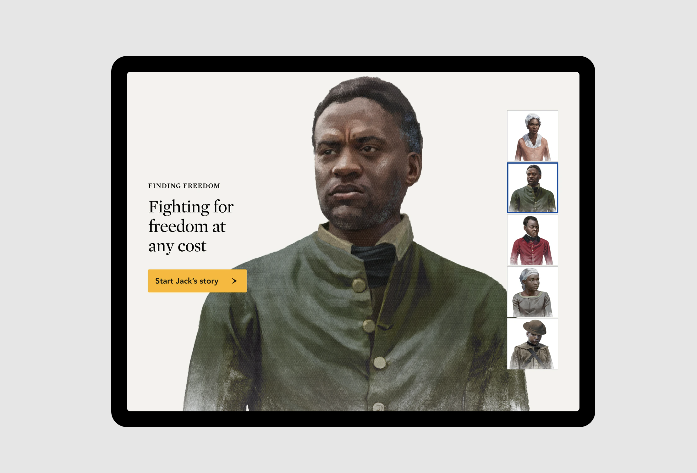
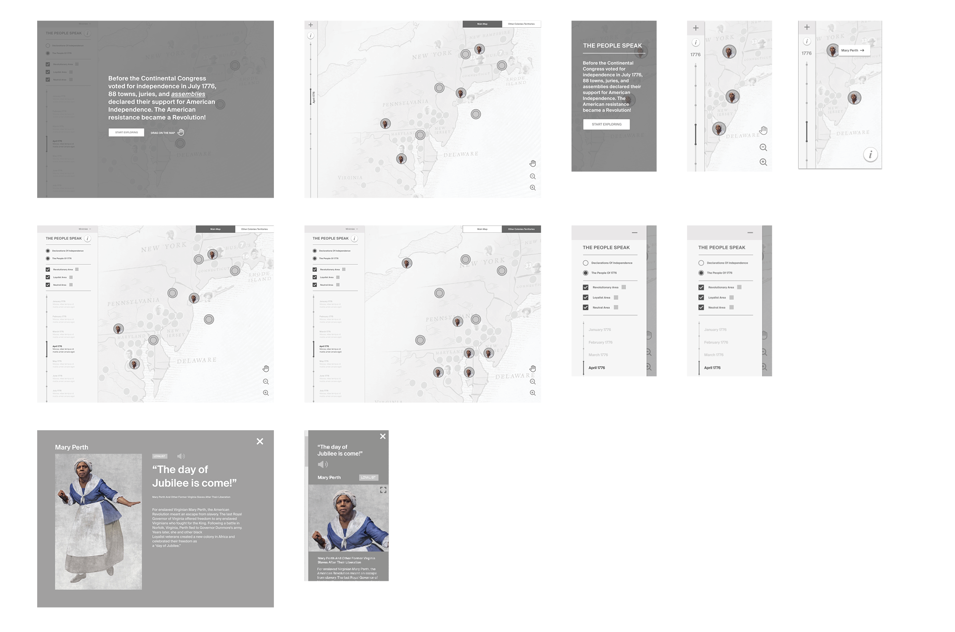
After defining core pages and key interactions we designed wireframes and created medium-fidelity prototypes.
Prototypes
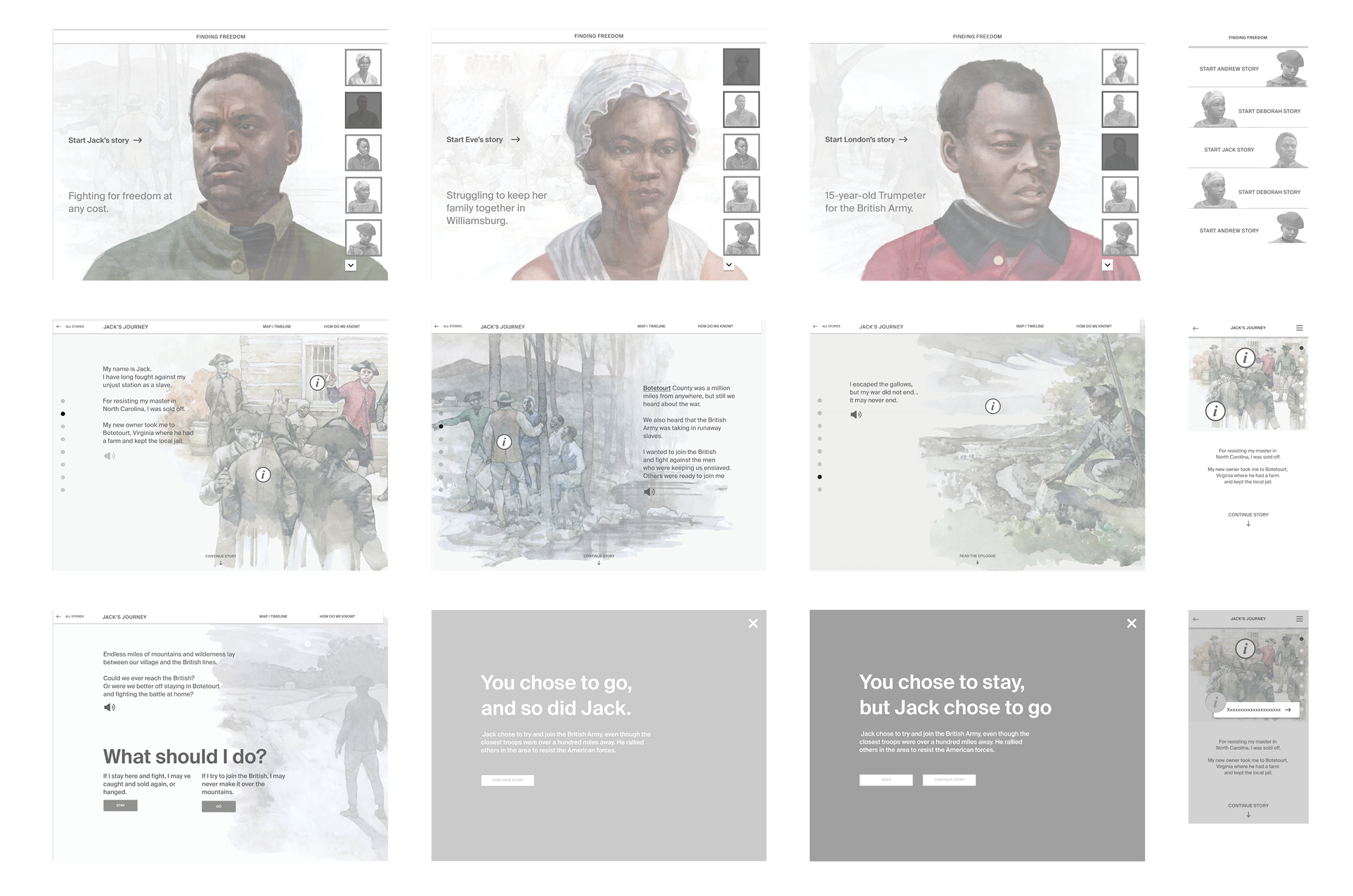
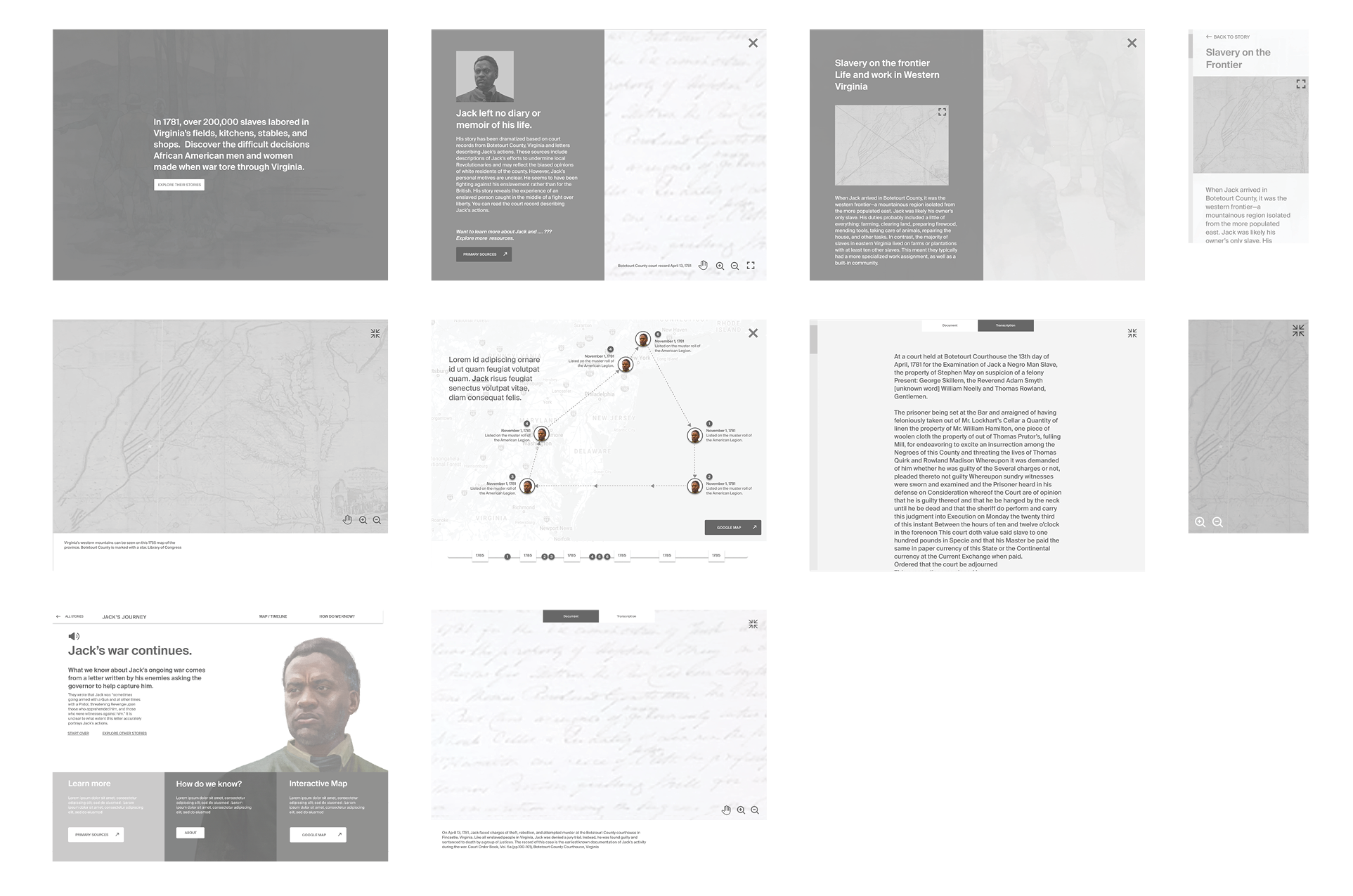
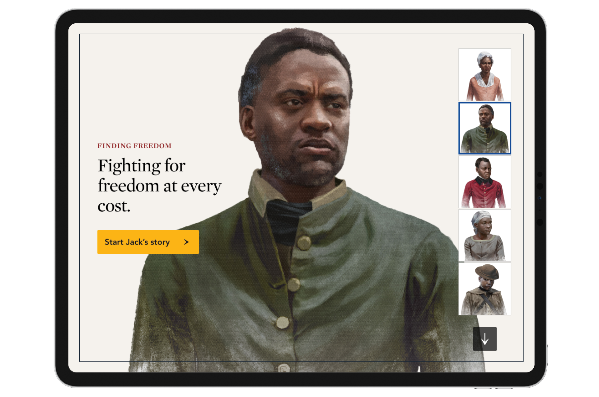
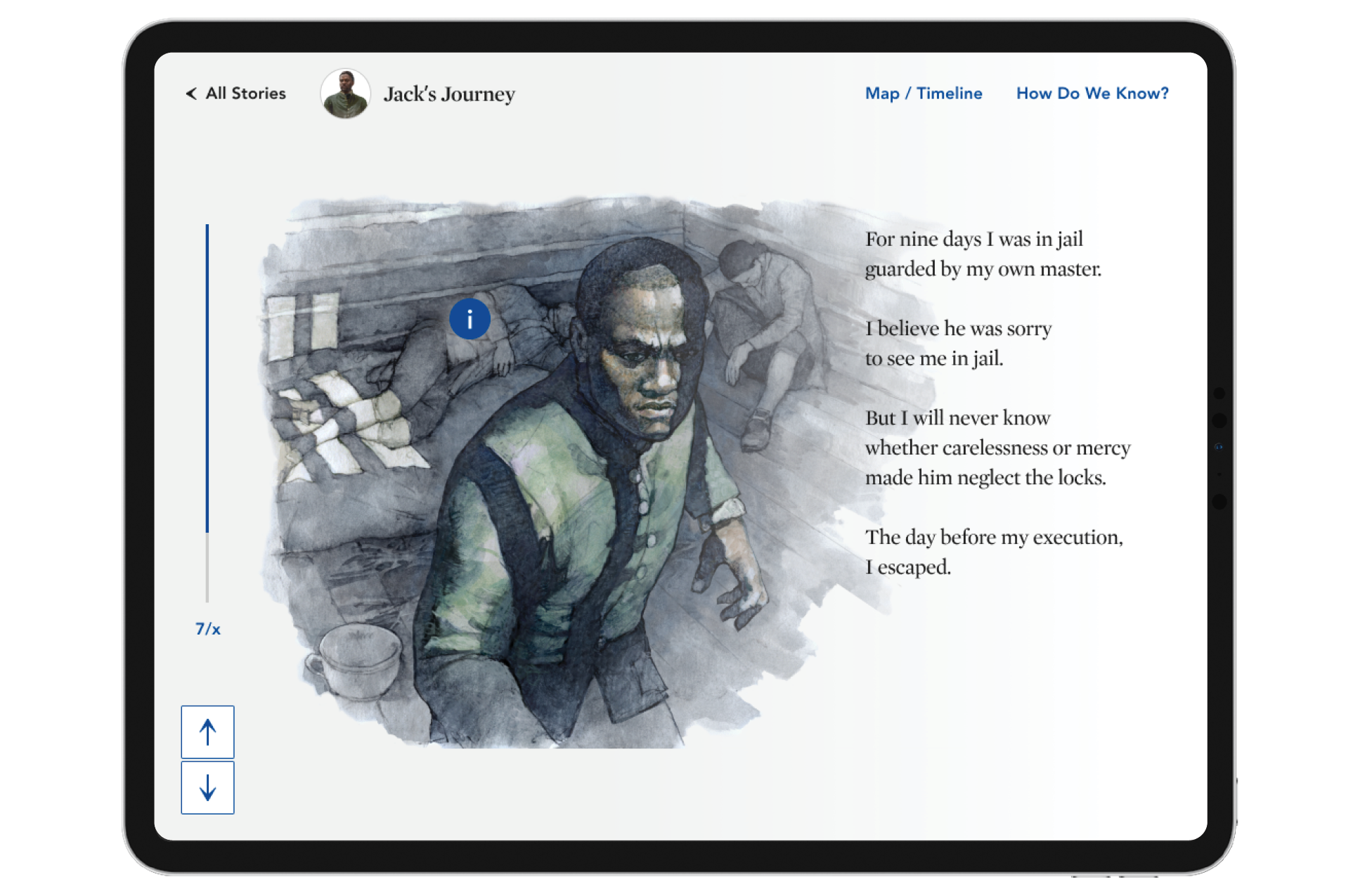
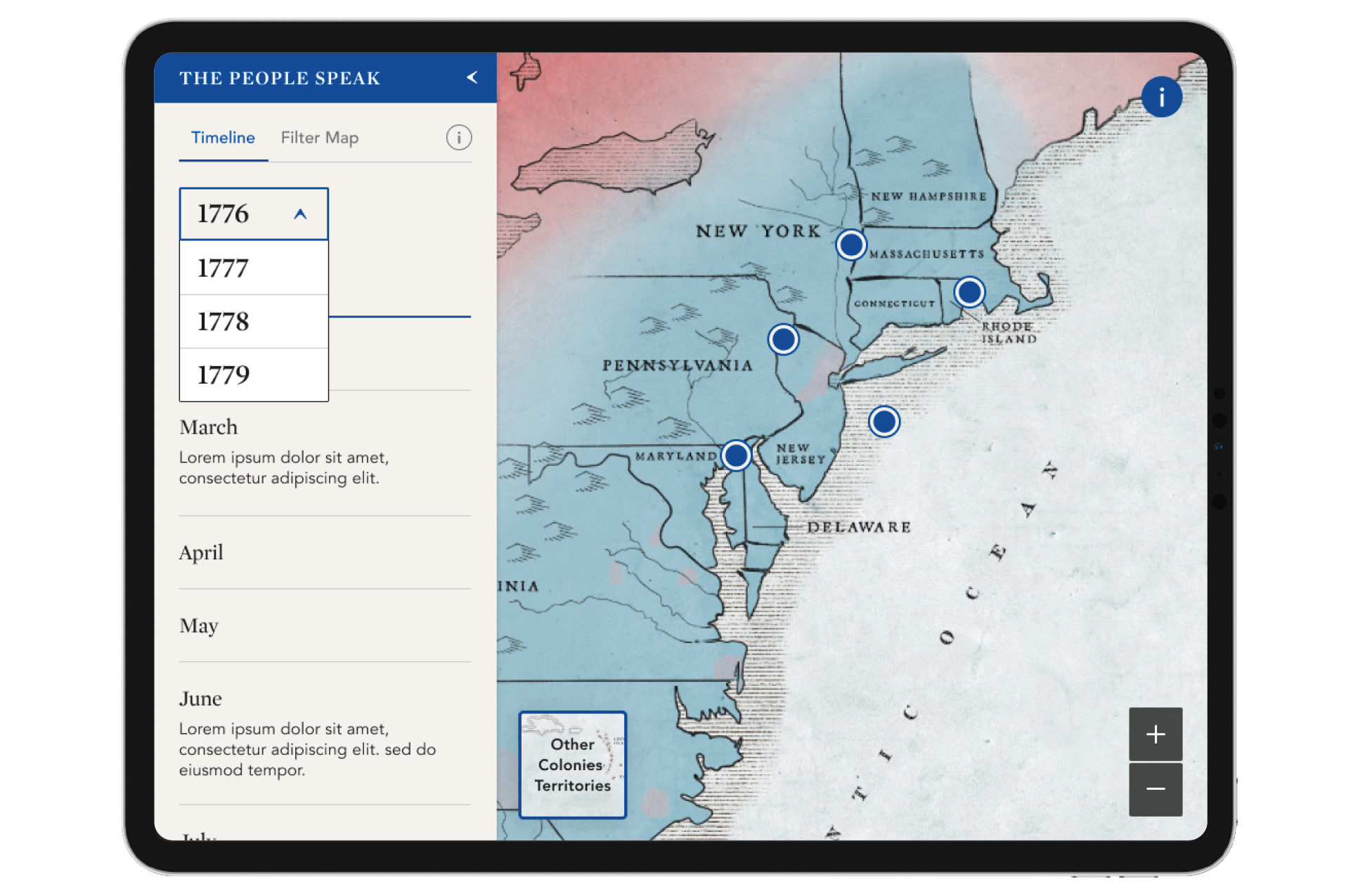
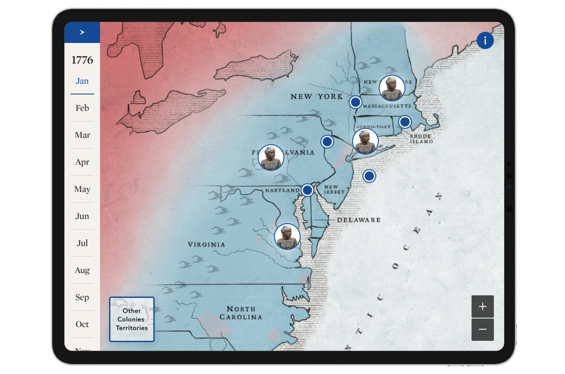
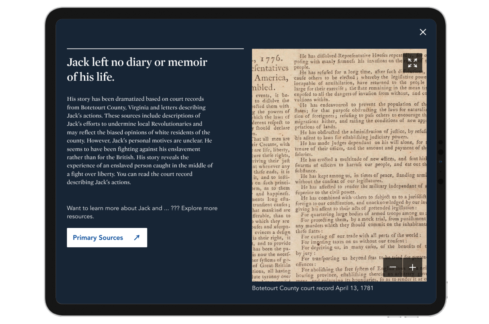
Web product 1: Season of Independence
Web product 2: Finding Freedom
UX specifications

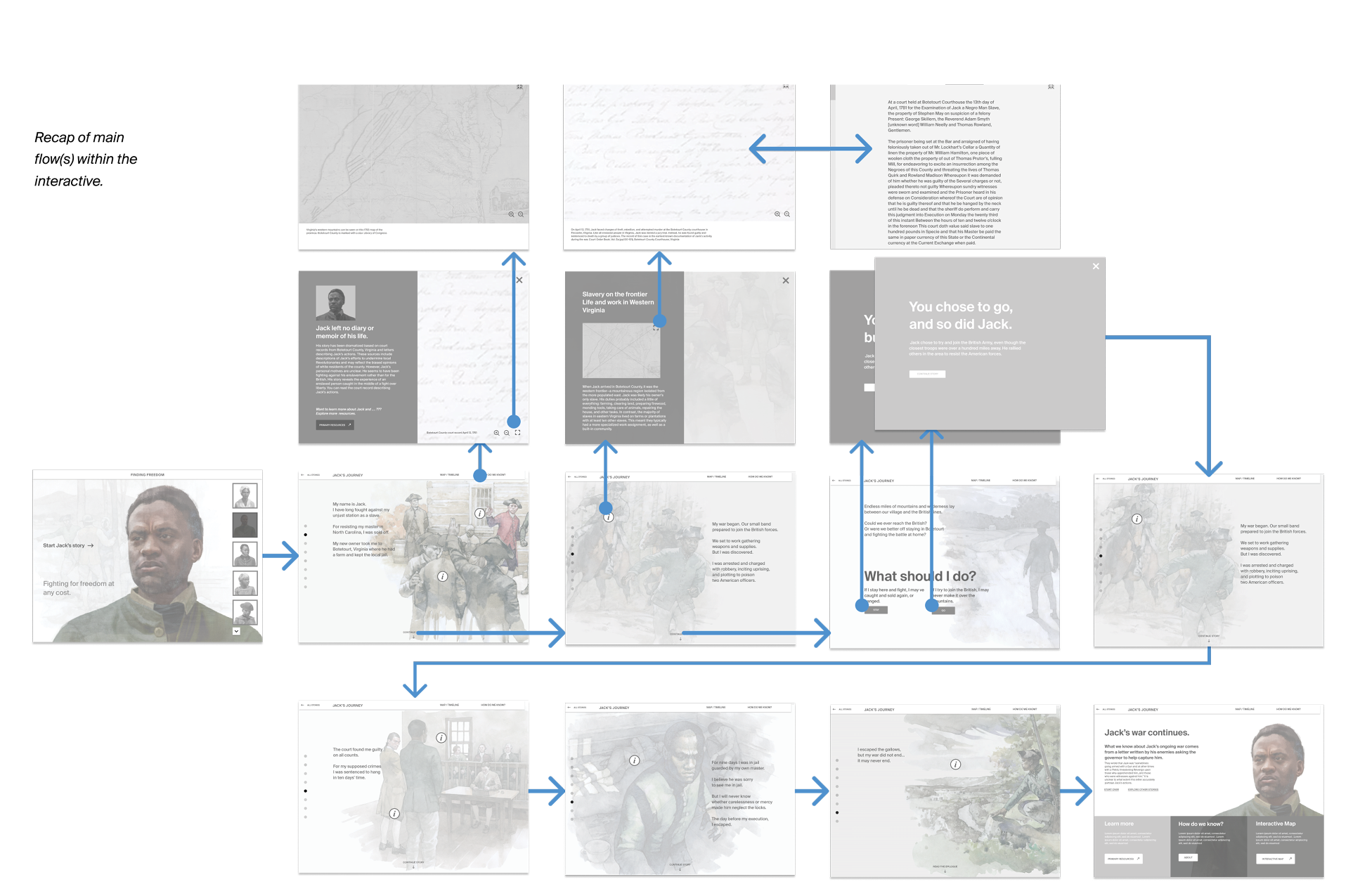
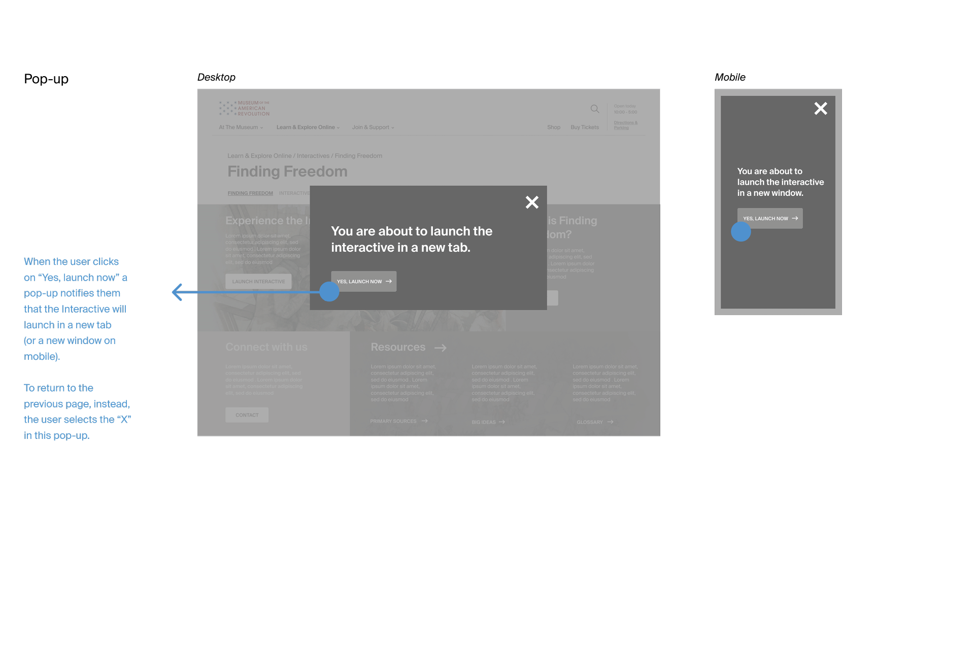
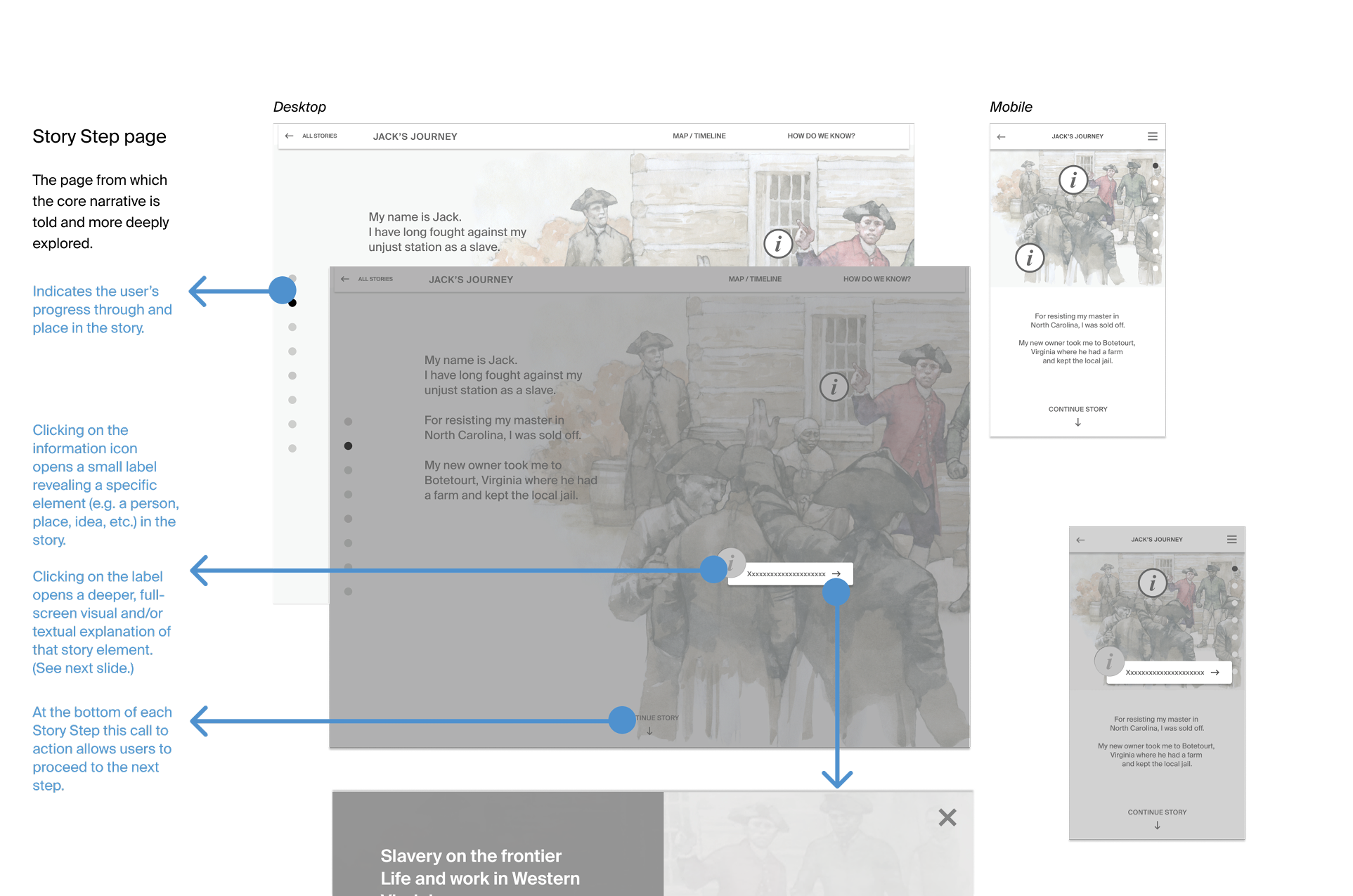
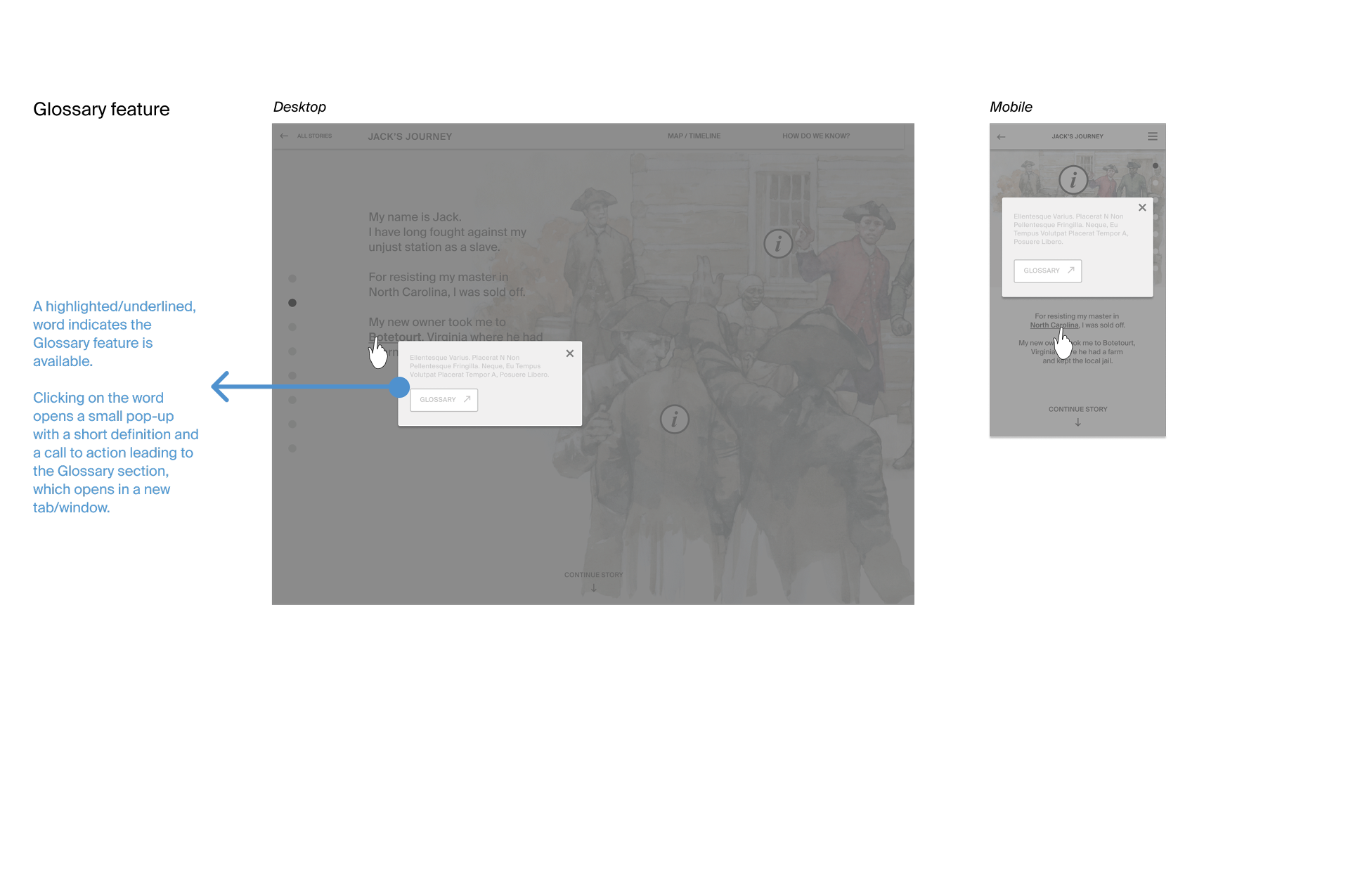
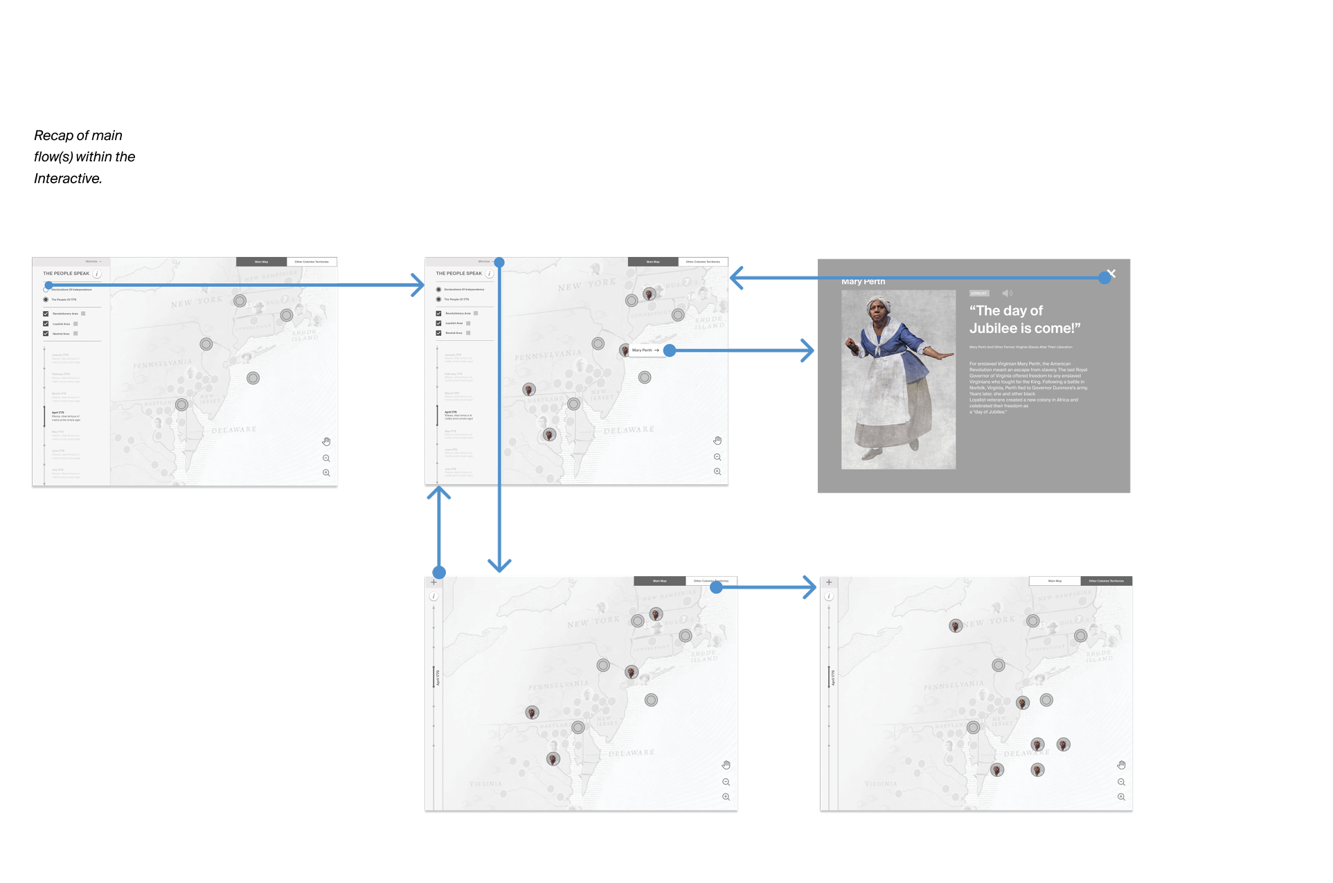
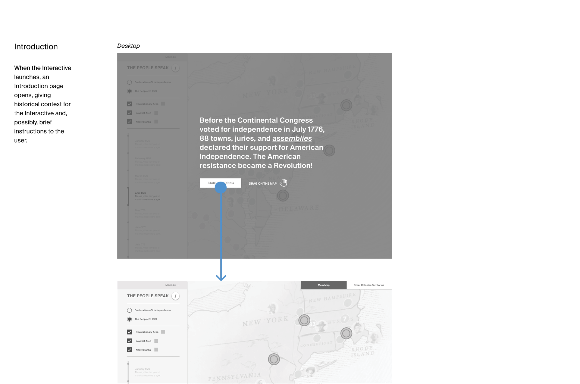
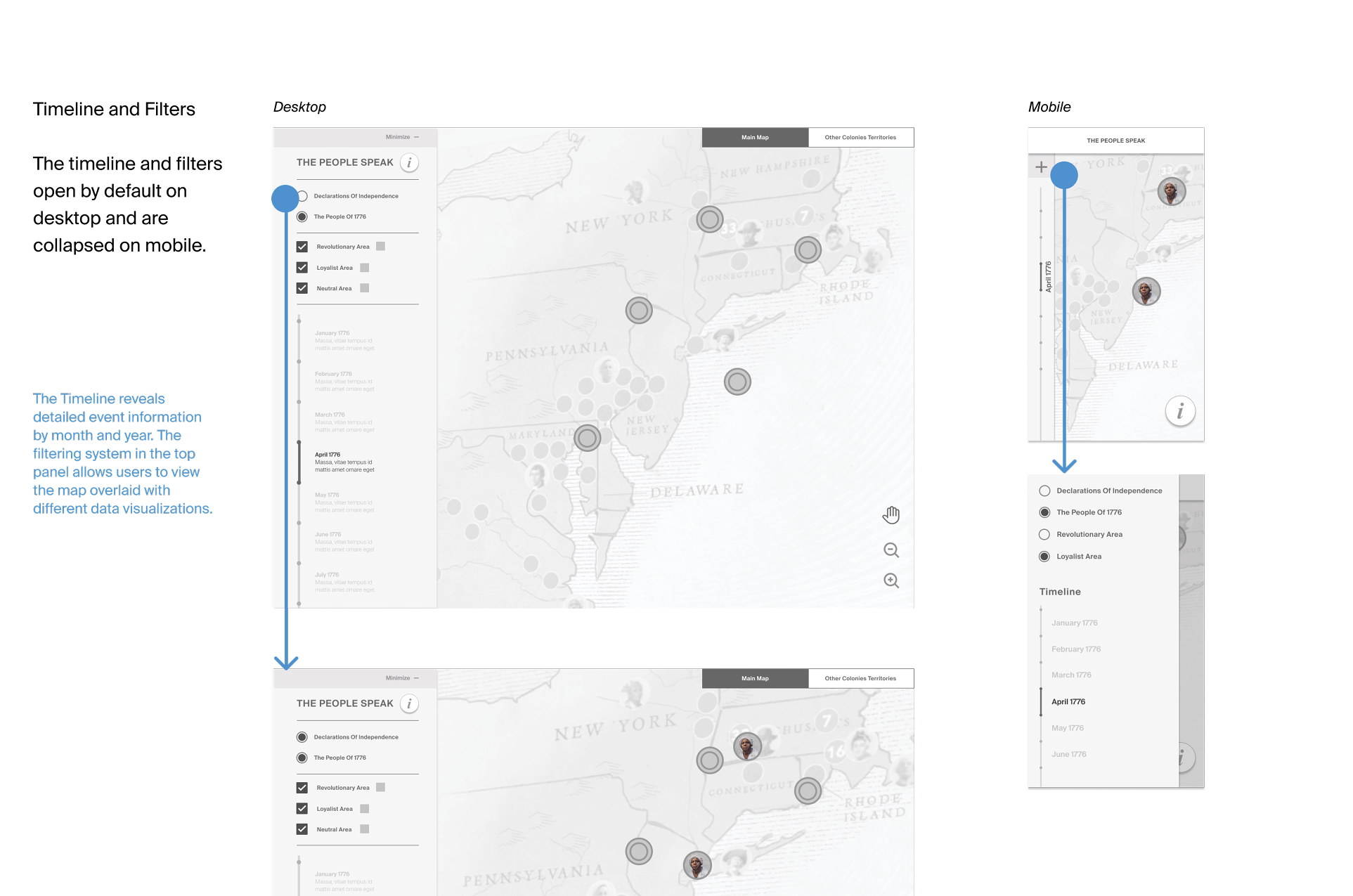
Writing detailed specifications for interactions and key transitions helped stakeholders better understand how the product would work and allowed them to review interactions one by one.
Later, those same specification sheets were used by the visual design team and programmers.
Visual Design
The product concept was translated into wireframes and medium-fidelity prototypes, which were handed over to the visual design team, who took ownership of the design. I stayed involved during that phase and was often consulted to ensure the user experience of both projects remained optimal.
Live products
“Both products are now live on the Museum of American Revolution Website.”
To be improved
Improve the onboarding process, especially for non-tech-savvy users.
Improve accessibility.
Improve responsiveness to ensure the experience works well on both desktop and mobile.
Next steps
Test both products with targeted users to assess usability and experience.
Integrate additional teaching resources into the experience.
Add more content to both products without compromising the core experience."
What I learned
The same content and flow, expressed at two different scales, can provide two very different experiences.
Every piece of research provides answers and feedback—there is almost never too much research.
High-fidelity prototyping helps clients understand the concept and also assists programmers in understanding how the design should be developed on the web and how it should flow.